Usability Heuristic Analysis on the MakeMyTrip App
Evaluate the signed-in flight booking experience of the Makemytrip app using Jakob Nielsen’s 10 Heuristics

What is a Heuristic Evaluation?
Heuristic evaluation is a process where experts use rules of thumb to measure the usability of user interfaces in independent walkthroughs and report issues. Evaluators use established heuristics (e.g., Nielsen-Molich’s) and reveal insights that can help design teams enhance product usability from early in development.
By their very nature, heuristic shortcuts will produce biases.
— Daniel Kahneman, Nobel Prize-winning economist
Persona to be considered:
🙍🏻♀️ Divya Tripathi from Hyderabad, her age is 32 yrs,
💼 She is working as a Sales Professional,
✈️ She often travels for business requirements and used to book 2–3 flight tickets a month.
1. Visibility of system status
The system should always keep users informed about what is going on, through appropriate feedback within reasonable time.

Description of the violation:
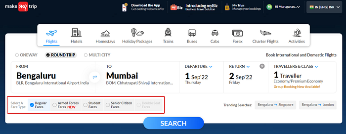
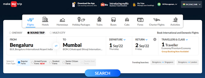
- The user has no idea what is going on due to a lot of information overload on the home page while booking a ticket.
- The Book International and Domestic Flights option wouldn’t find whether it is a text or call to action button option.
Recommendations:
- When the from option is selected, a green tick mark may appear to provide appropriate feedback.
- Recommend a multiple selection button for International and Domestic flight options.
2. Match between system and the real world
The design should speak the users’ language. Use words, phrases, and concepts familiar to the user, rather than internal jargon. Follow real-world conventions, making information appear in a natural and logical order.

Description of the violation:
- Double-seat fares are a new concept and not familiar to the user. This feature doesn’t know when to use either international or domestic flights.
- These tooltip comments wouldn’t be enough to understand the user easily.
Recommendations:
- I recommend real-life examples like simple phrases to understand, symbols, icons etc., of how double seat fare works in this system.
3. User control and freedom
Users often perform actions by mistake. They need a clearly marked “emergency exit” to leave the unwanted action without having to go through an extended process.

Description of the violation:
- While updating the flight details, if any mistake arises. The user has to start from the beginning.
Recommendations:
- Providing a reset/clear button option gives more freedom for the user to book a ticket.
4. Consistency and standards
Users should not have to wonder whether different words, situations, or actions mean the same thing. Follow platform and industry conventions.
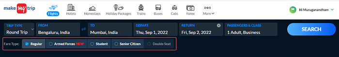
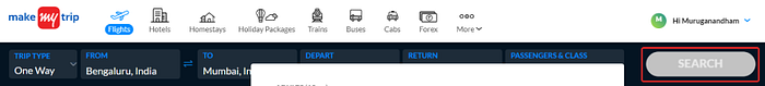
Description of the violation:
- The home screen and flight search pages are inconsistent. The fare type option texts are shortening on the flight search page, and the user will confuse with these phrases and feel no consistency towards the application.
Recommendations:
- Follow the design consistency and standards.
5. Error prevention
Good error messages are important, but the best designs carefully prevent problems from occurring in the first place. Either eliminate error-prone conditions, or check for them and present users with a confirmation option before they commit to the action.
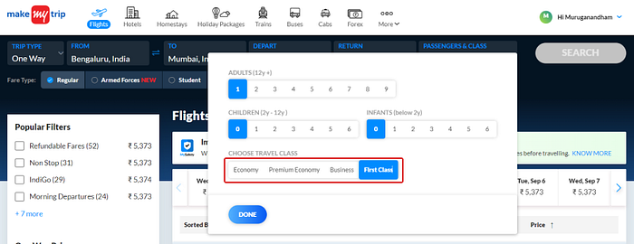
Description of the violation:
- The first-class option is visible here, but the user wouldn’t allow booking a first-class ticket after opting for a regular fare.
Recommendations:
- It can show disable button state for the first class option, which helps the users to understand that option is not available in this task.
6. Recognition rather than Recall
Minimise the user’s memory load by making elements, actions, and options visible. The user should not have to remember information from one part of the interface to another. Information required to use the design (e.g. field labels or menu items) should be visible or easily retrievable when needed.
Description of the violation:
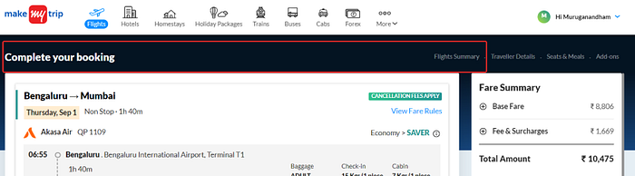
- For booking a ticket, the header text is inconsistent, and the user should not have to remember information from one part of the interface to another.
Recommendations:
- Using consistent header text until the task flow is finished makes it easy to retrieve when needed.
7. Flexibility and efficiency of use
Shortcuts — hidden from novice users — may speed up the interaction for the expert user such that the design can cater to both inexperienced and experienced users. Allow users to tailor frequent actions.

Description of the violation:
- On the flight summary page, a list of promo codes is visible, and the user cannot customise the options.
Recommendations:
- Providing Expand/Collapse option for each section on that page gives more customisable and speeds up the interaction to the user for booking a ticket.
8. Aesthetic and Minimalist design
Interfaces should not contain information that is irrelevant or rarely needed. Every extra unit of information in an interface competes with the relevant units of information and diminishes their relative visibility.
Description of the violation:
- On the flight selection page, the search button is disabled button state. The user will get confused based on this design aesthetics.
Recommendations:
- Show outlined button state on this page once the user is modified, then give a solid/default button.
9. Help users recognise, diagnose, and recover from errors
Error messages should be expressed in plain language (no error codes), precisely indicate the problem, and constructively suggest a solution.
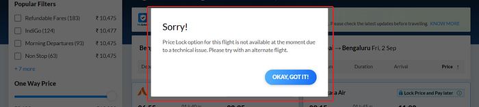
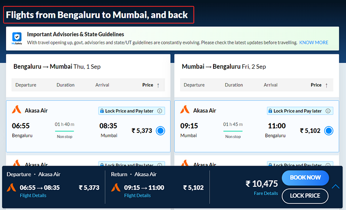
Description of the violation:
- The lock price option displays a standard pop-up message. It is difficult for the user to determine whether there is an error message.
Recommendations:
- Recommend error/warning symbols to this modal notification. So the user can understand quickly.
10. Help and documentation
It’s best if the system doesn’t need any additional explanation. However, it may be necessary to provide documentation to help users understand how to complete their tasks.
Description of the violation:
- When booking a ticket, there are no quick helpline documents or chatbot in the application.
Recommendations:
- Provide chatbot/help document. So users can understand and complete their tasks without any additional explanation.
If you liked this analysis, please give it a clap 👏🏻. It will prompt me to write more on the subject! Also, please provide valuable feedback to help us improve.

